Robert Frank was a swiss photographer and documentary filmmaker who later on became a binational. His best work is the book The Americans which was published in 1958, the success of his book highlighted him in society as a modern-day french philosopher de Tocqueville due to his political-philosophical ideas which he used in his photographic career of having a unique form of expressing the outsider's view of American society. His work was criticized by famous critic Sean O'Hagan in The Guardian as "the most influential photographic book of the 20th Century.
Robert Frank comes from a German Jewish background, therefore his family had many legal challenges and a threatening lifestyle due to the nazism movement in Europe, however, despite all struggles, they managed to escape from Nazi Frankfurt to a safer country like Switzerland. Robert's motivation to start his photographic career was coming from the want of breaking away from his family business-oriented family. As a result, to reach his dream, he trained under the wing of some amateur photographers and graphic designers which led him to release his first photographic book called "40 Fotos". After the release of his first book, he emigrated to USA New York, and secured a job as a fashion photographer at the fashion magazine "Harper's Bazaar".
The use of a black and white pallet in his picture depicts the cold and non-romanticized reality of New York's society.
The use of mid-shot in this photo captures the environment of the subject who is a poor working-class male
The use of contrast and exposure brings the rough texture of the man's dirty face to the clean eye, this leaves a clear indication and understanding of the meaning in this picture
Name: Eliot Porter
DOB: 6 December 1901
DOD: 2 November 1990
Country: Ilinois, USA
Eliot Porter is an American nature photographer, his remark in his work is the focus and stand out of the color to highlight the beauty of nature. Eliot started this passion from a young with his non-professional Kodak camera. As a great influence, in 1933 he discovered and liked Ansel Adams who also supported him in his career,
I personally love this image because of its color vibrance and connotation, the effect of the color contrast between the bird and background, is to first give the spotlight to the bird which is the main attraction, and also to make it as clear as possible to intake all the detail of the bird, this strongly relates to Eliot's dedication and work into the field of nature.
Line - A line is an identifiable path created by a texture, shape, or object moving in the same direction in a straight pattern. The line creates 3 effects, one is to create a sense of visual symmetry which adds interest to the picture by creating shape, two is to separate aspects into the picture dividing the zones into multiple attractions, and 3 it highlights a path that guides you where the focus point of the picture is.
Tone -
10/09/2022 Audience Theory
In order for a media producer to sell or publish a product successfully, it must either reach or create an audience that consumes and support your product, therefore many methods have come about which followed specific theories.
Hypodermic Needle Theory - This theory explains that a media producer slowly influences its passive audience as they are not aware of the influence. This has a big drawback as it means that it can slowly mislead and manipulate an audience without them not being aware.
Two-step flow - Two-step flow is the cycle in which a media influence reaches a mass audience through an idea leader (influencer) who spends its influence on his active audience mass, this also has a backlash as influencers are not to be trusted due to hidden info about them meaning that they may mislead and information or influence a bad idea to his audience.
Andrew Tate is an example of a two-step flow because Andrew is an influencer who spreads messages to under-belt influencers which spreads his message through generating media according to Andrew's message.
Uses and gratification Theory - The Uses and Gratification theory discusses the effects of the media on people. It explains how people use the media for their own needs and get satisfied when their needs are fulfilled.
Noel Deyzel is a professional bodybuilder and media influencer, the content he creates helps his audience with progress and how to improve performance in the gym, therefore his content comes under the category of information and is relatable to his audience.
12/09/2022Michael Batory and Photoshop
Micheal Batory, he is a famous polish poster designer. His style stands out from the rest due to his signature design of mixing two objects to create a subject. The two objects must make sense and have logic. Most of his work was used in music festivals.
For Example:
>Here we can see that Batory merges an opening scissor which he completes the object with a pair of legs that imitates the motion of the opening of the scissors. In order to make the poster suited for a music festival, the legs selected a link to ballet which is a musical festival.
My Version of Batory's style
> This is a second attempt at making a poster in Batory Style. Because this is an attempt, it is not a final assessment and it might change later on however I have used achieved this style by the use of mask and layer and also a shadowing tool in order to give the light effect. It is useful to use Mask as it helps with selecting the bit u want to keep from an over layer which is essential in order to make this effect due to using a different subject from a different layer.
13/09/2022AM. Cassandra and Illustrator
A.M Cassandra is a Ukrainian-born French painter, whose career expanded into the branches of typography and commercial poster design. AM was born in Kyiv in 1901 under the Russian imperial reign which was one of the toughest periods in Russia. Lucky enough, AM was born into a French family which helped him to move to France where AM went and studied art at the Académie Julie.
AM's signature style has been inspired by elements of surrealism (unnerving and illogical art which elements of real life) and cubism which can clearly be seen in AM's linework.
This is one of Cassandra's posters I have selected to recreate but in my own way, A.M's style of design it is very interesting as A.M combines the style of geometric for his line work and graphical design and sub-realism for the artwork ideas.
In my opinion, I really like this poster as I like the dark colour pallet and the use of gradient to give a bloom effect to the liquid making it create a contrast between liquid and solid background.
This is my first attempt at and piece in illustrator, as you can see I have chosen A.M's wine poster for influence. My own design comes from the liquid aspect instead of using uniform lines like A.M I have chosen the texture of brush in order to give a more realistic liquid physic, also A.M use a different in order to create an alternative light effect, however, I have chosen that my gradients are bright in order to have a more luminous effect.
13/09/2022 Camera and Shooting mods
Modern cameras allow us to manipulate pictures based on our desires, this could be done by changing the features and settings of the camera. These features are labeled in mods as Av, Tv, P, M, and maybe more. Selecting any of them determines how the picture would come out.
Aperture Priority: This mode controls the light exposure the camera takes by closing or opening the lens. This aperture is measured in the unit of F-Number, the number in the unit shows the size of the diameter, therefore this unit is translated as the Focus-Over the size of the diameter of the lens opening, the higher the number the less light taken by the camera. Aperture plays a big role in the depth of field.
Shutter Priority: This mode manipulates how long the lens is open and how fast the picture is taken. Its use of it is to freeze and capture the action either still or blurry.
> Shutter speed: 1/1
Aperture: 2.8
ISO: 100
The problem with this picture is that it is overexposed which is related to the size of the aperture.
Also, it has a very shallow depth of field therefore it is hard to understand any of the landscape
14/09/2022 Planning for your assessment
This is brainstorming for Ideas for the event advertisement. I will go in-depth in each theme and I will choose the one which is the most suitable for the assessment and available for my expenses and facilities
Taglines: Attack of the Titans
The Colosseum has come to London
Back from dead, Back for blood.
16/09/2022 Introduction of sound
Sound Design: Film and Television are "visual-audio" media, majority of people think that filming and TV are only visual media sources however most of the effect that is irradiated from a movie comes from sound. Sound is essential as it creates the atmosphere and gives us a better interpretation of what the movie tries to achieve.
Diegetic Sound: Diegetic sounds are sounds that are part of the scenario and story such as ambients, This includes: Dialogue
Sounds made by objects
Music playing on the radio, tv, etc
Non-Diegetic Sound: Anon-diegetic sound is a sound that is not part of the story and scenario environment and is an overlayed sound. This includes NarratorVoiceovers Soundtrack
Parallel sound: A sound that matches the visual scene and narrative is called parallel sound as it is parallel to the narrative. This includes non-diegetic and diegetic sounds.
Contrapuntal Sound: When a sound is used in an opposite emotion and mood than the scene and narrative. This includes only Non-diegetic sounds
Foley Sound: This is a different chapter of sound engineering than the one covering the handmade version of sound making, more simple is the making of the sounds and adding them to the movie after the video editing is done.
20/09/2022 Studying Techniques of Typography
Typography has evolved in design throughout time, first-ever type of typography for printed books was Blackletters which was not as pleasant as it was not as clear and hard to read therefore once the spike in the printed industry and technology came with new typography designers.
20/09/2022 Photography Reflection
A photo is more than 1000 words, therefore photos have a more powerful impact than text as it delivers all of those words once in a visual presentation. Today's modern society relays heavily on visual media due to is a simple and effective method of delivering its product, also it is more accessible and low demanding in skill. Photography is a big pillar in every culture as its main source to spread and maintain the culture's mainstream lifespan, which makes it hard to remove and is used in today's media.
21/09/2022 Performing photography
An essential part of photography is light, without the light the photo would be just black which stops you from achieving your message, therefore you must manipulate the light to achieve your effect. In order to manipulate the light, you must learn the types of light.
Fill Light: Secondary light which is placed opposite the key, it is used to fill up the shadow by the key light exposing. To create this light you must put the lamp further than the key light and the subject.
Back Light: The use of the backlight is to divide the subject from the background, usually backlight is placed behind the key light and fill light.
Key Light: The light used to highlight a subject is called key light, this has the effect of subjecting whatever is in its exposure.
Also, another element of photography is the style of light placement in order to create a specific effect that affects the depth of the image and its geometry of it.
Split Light: This is the placement of only the key light at 90 degrees in order to split the face or the object into half, it's essential not to use any fill light or backlight as it adds to the death of the subject.
Rembrandt Light: Rembrandt is a famous artist who popularised this technique, it consists of placing your key light slightly closer to the subject's face direction and at its head height.
Loop Lighting: Loop lighting is a technique of placing the camera 35-45 degrees from the back of the subject and it uses a reflector on the front of the subject to light the face of the subject
Broad Lighting: Broad lighting consists of the subject face being closer to the light source and slightly angled, therefore creating the effect of only showing how closer the light is to the face
Butterfly lighting: This technique is achieved by placing the light source behind the
21/09/2022 Analysing a poster for an event
The poster selected is for a demo that I want inspiration for my event, is used to give me an idea of what a flea market poster looks like.
For colors, I think that is debatable as it depends on the theme of it, however for this template it is colorful as it attracts the person's excitement to come to the flea market.
The Paintbrush font is an inspiration I would take in my poster due to my genre being streetwear, and also add a second one to show the theme of it, an effect that also might be drawn attention as its various design might please an outsider's audience.
Imagery is essential so that through your imagery you can get a straight understanding of what the event would cover and the facilities it has, therefore I would focus my attention on the image as my theme might be complicated.
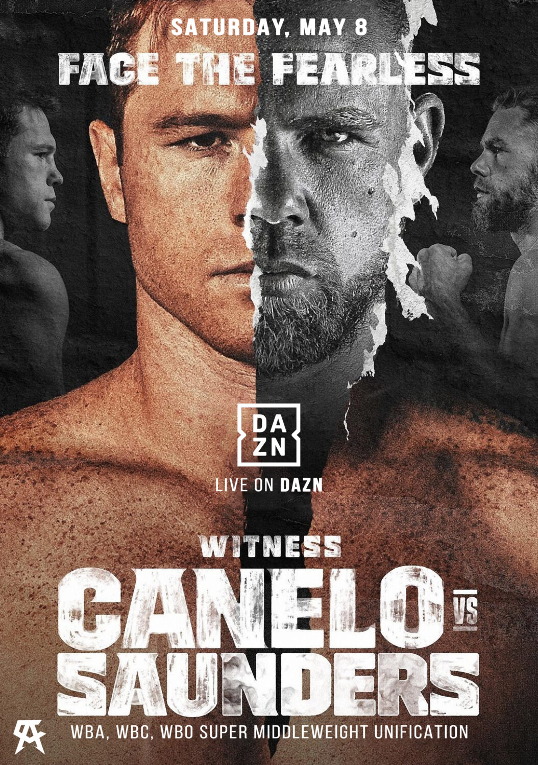
This is my final choice which is a boxing event, this is a demo of the type of poster I would love to remaster. The split design of the poster illustration makes it stand out by giving each main attraction the space to clearly introduce them selfs, this suits as both attractions are the whole event, and also it creates an effect of the clash which clearly indicates what the event is about.
The typography also creates a rough ascetic, by its decayed paint texture which creates the effect of roughness and aggression, also the use of San sheriff makes it seem a serious event.
23/09/2022 Auteur Theory
For a movie to be considered GOOD, it has to be clear, engaging, and entertaining, however, this theory adds to the list of what a GOOD movie is. The auteur theory focuses mostly on the ingenuity and uniqueness of the movie which earns you the classification of being an auteur director. To be seen as an auteur you must have 3 elements, which are: Basic competency - being able to use fundamentals
Interior Meaning - the message the author tries to connotate
Signature Style - Features and elements which make it yours.
Ilya Naishuller - Film
Ilya is a Russian movie/director writer and Rock musician, Ilya started his media career with his music which later on influenced his movie career work. Ilya's first movie was Hardcore Henry which gained popularity of its unique POV camerawork throughout the whole narrative, the influence of the camerawork comes from his signature style of recording his music videos which are made up of, humor, chaos, and POV camerawork.
Nikita Buyanov - Game
Nikita Buyanov is a Russian game developer which has created a game called Escape From Tarkov, its uniqueness is the amount of work and development Nikita and his team have done to make a system and gameplay as realistic as possible, also Escape From Tarkov is the first ever RAID game genre making it stand out from all the FPS games on the market.
Cypress hill - Music
The famous band Cypress hill is one of the first Latino Hip Hop bands, their unique style is composed of elements such as non-commercial music which had a more rough melodic aspect, underground music exposing life in the 90s west coast poor living conditions, and the essential is the American-Latino culture which was embedded in their style of music and presentation. They are seen as auteur music producers because of the fact that they were the first bands that started American-Latino hip hop.
Ant Middleton - TV show
Ant Middleton is an auteur Tv presenter on British television, Ant's personality and presentation are strongly linked to the army, therefore, Ant hosts multiple shows such as Celebrity SAS which challenges celebrities to live and go through what Ant's army special forces training was like. Ant spreads this army identity in his multiple books and other TV shows.
27/09/2022 Photographic Composition
Name of Compositional Rule
What is it?
Example
1. Rule of thirds
It is a 3x3 grid in which you keep the main attraction
between the lines, this helps with keeping the object from the center which
has a more interesting effect.
In this picture, we have a left, center, and right attraction
2. Leading Lines
Leading lines is a technique that manipulates
the environmental lines and contrasts with a leading object.
The example of leading lines in this
picture is the rail track which leads to the depth of field.
3. Pattern and Symmetry
Using identical shapes from objects from
a picture in order to either create a symmetric pattern or texture and more
interest.
The use of symmetry in this picture is to
highlight the architectural presentation
4. Framing
Framing is the method of using certain
shape covers to separate your selected attraction from anything else around
it, this is useful as you manipulate what and where to look
5. Depth of field
Depth of field is the background blur into the distance, its effect is either make it easier to focus on the closer objects.
6. Viewpoint
The viewpoint is in which position the camera
is taken and what perspective.
6A. Bird eye View
Bird's eye view is a photo perspective
that you have taken from above, its effect is to captivate a whole landscape
from a different perspective
6B. Worm eye view
This view is the opposite version of the
bird's eye view, meaning that is taken from below
28/09/2022 Levi Stauss Binary media theory
Claude Levi-Strauss
Levi-Strauss is a french anthropologist who studied aspects of humans from past and present society and implemented them in the media, his work was the main essential to the development of structuralism.
Born
28 November 1908
Brussels, Belgium
Died
30 October 2009 (aged 100)
Paris, France
Binary Opposition Theory
Binary opposition in media is seen in the narrative of the media product, this meaning that for any media character or situation there is an opposite. Its use has an impact on the narrative making it more intriguing, and thickened, and introducing a form of contrast. Such an example of binary opposition in movies is good versus bad which is the most common in every media narrative form.
Examples in Trainspotting
In the opening of Trainspotting, we can see Renton getting chased by security guards which contrasts an opposing binary between Cops and Robbers, and introduces Renton as a rebel and an anti-social part of society(Thieves), all of that in a more interesting and visually contrasted introduction.
Also, another Binary Opposition is between the football teams, we can clearly see the contrast between professional and healthy teams versus the team of poor amateur and unhealthy who are seen not as elegant and once again anti-social.
Examples in Dizzel Rascal's "dream"
In Rascal's music video we can see a clear contrast between the posh, white old lady versus the rascal-like, black, young man representing social contrast. Rascal presents himself as the opposite of the higher class.
Examples in other media
An example here of binary opposition is Denzel Washington acting in the role of a hero under the character of a hard-working civilian whose goal is against the protagonist in this scene is a Russian mobster, this, later on, escalates into a fighting scene where once again, opposing binary is shown but in a physical action moment.
28/09/2022 Research and analysis of Designers
Studio KXX
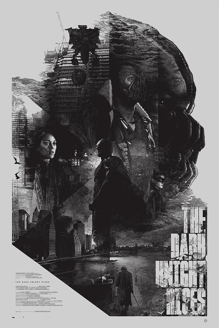
Studio KXX is a polish art studio that has a unique and more trend influence on today's generation of graphic designs, The studio is led by Krzysztof Domaradzki, a specialized graphic designer from Poland who works in multiple fields, he has a unique design in which he designs. His style is a mix between comical sketching, drawing, and graphic design.
I have chosen this poster as I like the graphic element of adding a character's close-up of their side profile and filling the situated shape by the chaotic environment in this case but at the same time keeping the character's side profile shape.
The color scheme is a black and white pallet which gives a sense of seriousness and darkens, also the use of color is smartly used in order to still give the effect of light and not solidity in not affecting the shapes and clarity of the imagery.
The typography is a bold Sans Sheriff which has a black and white pallet in order to fit and be uniform to the poster, however, even the rough texture of the letter fills blends with the environmental element from the imagery.
03/10/2022 Graphic poster progress
This is my first attempt at working on the boxing event poster,
my first attempt came good as a concept however I have to work more on the graphic aspect, this is due to the fact that is to close to the original picture, therefore giving more credit to the picture sources and not mine.
05/10/2022 Fashion photography
Genres of photography:
Many genres of photography come under the umbrella of Fashion Photography
- Editorial photography
- Advertisement photography
- Beauty photography
Editorial photography - Editorial photography is photos that appear next to and along text in order to help the reader clearly visualize the purpose of the text.
This Editorial picture uses low-key light to only define only a selected area that the text narrative might describe, most of the hard light is on the front face of the model, whereas the backlight is on the side of the character meaning that the background is not as important.
Advertisement photography - Advertisement photography is photos used to present a product in as much detail and interest as possible.
This advertisement photo uses high-key light, its effect is to create as much exposure to the product as possible, and this is for to audience to clearly inspect the product.
Beauty photography - Beauty photography is photos that are close-up of a subject, its use is to highlight their attractive features and details for their, photographic, commercial, editorial, or personal.
This photo is a close-up of the model's face which you can clearly see has make-up and beauty elements, the use of hard light is to help the photographer select the area of interest in the picture.
In this picture, the pose is relaxed laid back, hands crossed however body direction is facing directly to the camera making it a generic casual shoot. The lighting is a soft light that has high exposure not shadowing any bits of the picture.
The pose in this picture is a dominant standing-up pose in which the body direction is slowly tilted towards the camera, however, I have experimented with LED color filtering creating a binary opposition between colored high key light.
Final pieces for the event
Evaluation of the project
My chosen event is a boxing match between two champions, Mike Tyson and Tyson Fury who has reputations as legends in the boxing industry, therefore I choose to put them into a boxing event that spikes interest. My aim is to create an event that excites boxing fans by not only answering their question of who's better but also entertaining them by seeing a match that is performed by loved legends which creates a nearly mythical-like atmosphere. The target audience would be boxing active but also passive audience due to the massive reputation and name that Mike and Fury have in the overall media platforms.
This is my final piece for the graphic poster, it is a 1/2 split poster designed in which I chose to give a clear and equal presentation of Mike Tyson's representation of the USA by adding the USA flag in the background however over it there is a low opacity of a picture which represents his old school prime highlighting his boxing legend reputation, on the other side you have Tyson Fury which similar elements can be seen, a UK flag showing the national representation and a low opacity picture which highlight his prime career as boxing. Red, white and blue is the dominant colors in the selected color pallet which reflect the UK and USA national flag colors which help to merge demographics. The graphic poster is an inspiration by the Camelo and Saunders fight poster, however, I chose to do mine more colorful and not noir, giving more visual and meaningful interest, the opacity overlay is an influence by a graphic designer called Studio Kxx which I have done some research.








Comments
Post a Comment