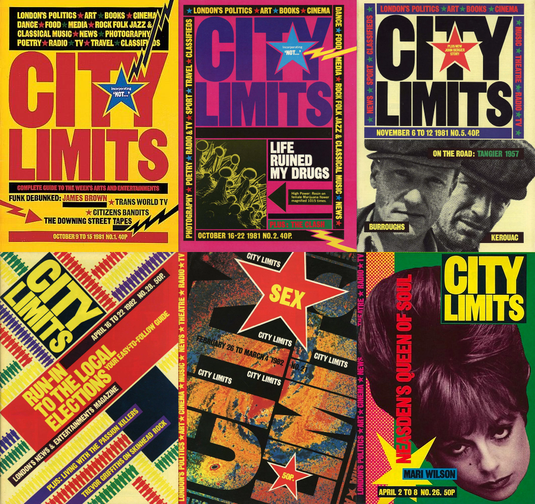
David king is a British magazine designer who was born in 1943 and unfortunately passed away in 2016. David was also a historian of graphic design who did research and collected pieces from different historical, political, and regions, while David was researching he collected the biggest collection of soviet magazines and photographs. This collection helped David with designing and creating a Russian history book revealing the problems of the Russian revolution.
David had a great attraction for soviet and revolutionary culture and figures such as Leon Trotsky, therefore when his tutor Robin Fior introduced David to the soviet constructive graphic style and art, he loved it, later on, David used this style in western media in order to create his identity.
David's magazine covers can be seen by the geometrical typography and design that he has soviet influence contrasting in a political context because such art was to present a communist mindset however in this context it presents western democratic media. A great example of this contrast is in the red star or just the star shape, in general, is a communist political representative however David uses headlines that would be taboo in communist media.
I personally love his style from two perspectives, one of them being the historical representative because I have a big interest in and love for history and historical culture especially from the political interest, two, is the color pallet and saturation which does spark color however is not very bright.
18/10/2022 - Regulators
Libel Law- The libel law is a form of government censoring with the purpose of not allowing publishers or any media producers to falsely or directly target a person for the sake of affecting that person's reputation, lifestyle, and profession.
Editor's code of practice
Accuracy - real and in-depth detail which is not falsely done
privacy - not breaking into the private life of the subject
no harassment -
report crime - report a crime that has been done
no usage of spying equipment or hacking devices
allowance of replay - giving an opportunity to the subject to comment on the situation
Same in the advertisement industry, all products cannot promote whatever they want, therefore they must cooperate with advertisement regulators such as Ofcom, BBC Trust, Asav, Pegi, etc...
The product must be: legal, appeal to standards, be realistic, honest, and have social responsibility.
Ofcom - Ofcom is the British communication regulator, Ofcom only regulates TV, radio, fixed lines telecom, mobiles, and postal services.
ASA - The advertisement standards authority does regulate commercial media such as advertisements.
British Board of Film Classification - BBFC is a private and independent company that does not profit from its work. Its role as regulator is to rate visual media to which age demographic its appeals and is exposed.
VSC - Video standards Council is another example of a video media regulator worldwide, their regulation appears most video games,
19/10/2022 - Stop motion animation
Pixelation - Pixelation is a type of stop-motion animation, however, live actors are performing.
Example: Sledgehammer music video
Puppet - This is a stop-motion technique that includes puppets as the characters
Example: Isle of dogs
Claymation - It is the technique of using clay to make the setting, character, and objects for a stop-motion
Example: Bob the Builder
Cut-out -Cutout animation is a form of stop-motion animation using flat characters, props, and backgrounds cut from materials such as paper, cards, stiff fabric, or photographs.
In this short film, the technique used is a combination of pixelation because it is performed by a live actor and object as most of the stuff mimics a form of movement, which for example boiling water is represented by bubble wrapping paper.
This stop-motion film is called Strong Boi and its duration is about 10 seconds. The narrative of this movie is about a small clay figure lifting a clay barbell which at some point, unfortunately, falls over him ending the movie. Strong boi is claymation, as its figurine and objects which are linked to the movie are made out of clay. Also, this has been done at 13 pics per second making it more smooth in the visual flow of the movie.
19/10/2022- InDesign Exercise
In this part, I have created 3 columns with a gutter of 6mm. After the columns, I added automatic page numbers by adding a text box at the bottom of the columns and I have given a special character for counting the pages. C
31/10/2022- Rules of Typography
Entry points - Entry points are elements that are used to direct, help and introduce content in the magazine to the reader, things such as titles, subheadings, and first lines should be separated from the main text to keep the order and point of being a headline. One thing you should avoid in your paragraphs is to have no indents, that is for conserving the signification of text separation. A good example of entry points is dropping caps.
Line length - Line length is how many characters are on one line, the number of characters should be between 45 - 95 per line including spaces, this rule is to improve the readability of the line, if there are more characters then limit you will make it too long and if is below you would make it too short.
Alignment - Alignment is essential in the paragraph presentation, you can be creative however it is important to follow some rules such as using justification to don't create gaps like rivers among the lines, to avoid such things you need to use justification on line 60 wide. Another rule is to choose between left aline or right aline which is where are line finishes symmetrically.
Typography - Typography is an important piece in expressing the text, designing it, or anything that relates to the freedom of creativity; however, you must keep the x-height the same.
Magazine analysis
This magazine is a GQ magazine whose target audience is middle-class and upper-class people with an interest in showbiz and fashion but in a very elegant and professional way. In the main image, we can see a close-up of the famous boxing world champion, Tyson Fury, just by its presence we can see that the influences of this magazine are elite and professional. The bold italic typeface of the GQ logo con-notates a feeling of dominance and power due to its dominant size among all other texts.
I found this GQ magazine cover got my attention by the diverse typographic typefaces in its cover stories. For example, in the higher-right corner, we can see the change from the beige bold San serif to a white hair serif typeface, also another typographic element that captured my attention is the layout and typographic rule of alignment corresponds to each other, for example, if the text is right side then the right alignment rule is applied, this creates a uniform and neat aspect.
The photographic element of this magazine also is used to con-notate professionalism and high ranking due to, for example, the key lighting is on the guest's face, in this case, Tyson Fury, to show that only by the face you can pick up and recognise without with any written information, therefore making me understand that the person of this magazine content are such high elite in which you as a general, high-end or intellectual audience will pick up directly who it is by its acknowledge in the media and domain.
GQ magazine is known for its elegant nature and the middle class's media, therefore in the magazine's spread, the typography is minimalism both in size and page covering, the typeface used is a very thin hair serif for the caption of the picture and a standard bold san serif for the headings, quote pulling and sub-headings, this typographic choice is to give an elegant aspect but also caption the picture and presenting all of its features without visually be above or balanced with the picture. Minimising the text in such a way allows the magazine to sponsor the product at its crude peeks which is the main role of such a high-end and influential commerce magazine.
This spread has captured my eye with its elegant aspect which is found in the layout, color, and typography. The colour pallet chosen is composed of black, white, and red which visually appeals to the photographic colour element and lighting.
02/11/2022- Area of investigation planning
Planning Ideas
Community
Targeted community: Sportsman community
Analysis of the lifestyle and effect of this community
history of sports media
personal blogging
interviews of people who are part of this community.
Commerce
Target commerce: Fashion commerce
analysis of the history of this commerce
social impact
culture influence
Goal: Explore fashion throughout history and its significant
interview with people of the past
Questions for the interview:
What year were you born?
How did people dress?
What was a fashion trend?
What was significant about it?
04/11/2022- Podcast analysis
TASK - Listen and analyze.
Replay all/
Replay/ -Right at the beginning of the show I can already see that this show targets the Gen Z audience by the main subject. in this case, being a TikTok trend and the way of explaining it covers both the information characteristic and entertainment elements. For the educational aspect, the podcast really breaks down the trend from its right beginning, straight from the first account that started this trend, on the other hand, you have the entertainment aspect which really makes its presence of its comedic presentation and humor in which the co-presenter commentates on the subject.
/Replay All/ it's a podcast whose goal and plot are to discover the internet's media trends and discuss them in a satiric way. Posted on 24 November 2014 by Alex Goldman and Emmanuel Dzotsi under the provider of Gimlet Media was shut down after 8 years of broadcasting due to allegations of racism and problematic ethical work problems at the Bon appetite magazine, which is part of the same company, Replay All has become big in the categories of non-fictional, culture and technology, which really could be seen in its podcast behavior and way of presenting.
I personally find the narrative of this podcast very strong and well done as it contains anecdotes of the people's experience with the subject matter and examples of the subject in multiple ways, on this narrative chapter I liked it however the melodic part is not something I would like as it sounds very digital and pop genre roots which do not reflect on my preference in music, but it does on the aspect of the podcast.
Youngblud's podcast
Youngblood's podcast aims to explore the stories of people's experiences and really has little influence and opinion as possible, this podcast I would say that this is in the both relativity and informational categories in the uses and gratifications because I can see aspects of information from Yungblud in-take of the story and how he really elaborates the main subject topic which in this case is anxiety problems, therefore this suggests that he describes the in-death problem to his audience.
YungBlud's experience in media is not something new as he is a pop star already and has been part of showbiz before, therefore, with a big audience, he started his podcast on Radio1 on 18 Feb 2021 during the pandemic and it had success and good feedback from people such as the head of radio 1 who say "YUNGBLUD as an artist sums up what Radio 1 stands for: he's all about energy, passion, and excitement, and we know our audience has a close affinity with him and what he represents."suggesting that big names such as BBC Radio 1 does like and confirm the success of YungBlud podcast.
I liked this show as it has a simple narrative build-up of guest stories and commendatory from the presenter which also contains elaboration in order not to only pull the guest's tongue.
07/11/2022- Experiment with designing your magazine
08/11/2022- Semiotics and intertextuality
Semiotics - Semiotics is the investigation of logos and objects to find their meaning of them in that narrative or context, to break down a sign you must look at the denotation of the object and the meaning the object connotates to the audience.
Intertextuality - Presenting a different media text into your or other media text for a targeted connotation is called intertextuality.
Semiotics examples
The protagonist's costume - The untucked shirt symbolizes a psychotic and non-organized look due to being used in films to style psycho characters, therefore because the untucked shirt is part of the protagonist, the protagonist might be a psycho character.
The typography and design - The typography and neon color used in the title is also used commonly in old fashion neon signs which are only seen at night, this leads to the connotation that the movie's setting will be a constant nocturnal.
Intertextuality examples
This advert uses a high-reputation actor to sponsor their product by acting in the persona of a famous movie character, this could be seen in the introduction when the camera focus is on the actor Liam Nelson whose character is similar to the one in the movie Taken 3, however with slight changes into dialogue in order to present the product and make his character suitable for the scene is in, this was used as an advertising technique
14/11/2022- Digital image types
Resolution
> Measurement is in pixels per inch (dpi)
>Web images are typically 72 PPI, and they are low resolution and not to be enlarged, however, photography and scanning are done at a higher resolution to get a clearer and higher quality image however the file will be bigger. Print images are typical 300ppi.
Types of files
JPEG- JPEGs are perfect for photographs and images with a continuous tone, where light and dark areas are equal, although JPEG files are not good for text and sharp edges photos due to are anti-aliasing.
GIF- GIF files are good for comic graphics because it's good at rendering flat colored areas and they can also be animated, the negative side is that is smaller than other formats and it loads harder.
PNG- Portable Networks Graphics is a faster graphics file that supports transparency.
15/11/2022- Similarities and differences between magazines and digital publishing
Digital publishes-Products such as eBooks, online brochures, and online newsletters are digitally published because all of them are a form of the magazine however on the internet and have different layouts.
Digital publishes are not so far from real-life magazine prints, it really depends on the type of digital publisher because eBooks have a different layout that works in their favor than an e-newsletter layout, therefore in order to compare the two types of media platforms I will go for the magazine products and compare how they are comparable to each other.
British GQ has covered both physical and online commerce of magazines, therefore you can compare their takes on digital and print, this could be seen clearly in the reduction of text on the digital front cover and more editorial text due to the front cover only being for one story.
16/11/2022- Mise En Scene
5 elements of Mise En Scene
Mise En Scene translated in French means "all in the frame" which really explains the theory, however, in this frame there are 5 essential elements that radiate the message and the connotations to the audience.
1. Setting and props- the environment and objects are used to enforce the movie's targeted feeling or atmosphere to the audience in which the narrative intends.
2. Costume, hair, and make-up- The way that a character is presented reflects on either, what features this character has and how strong they are implied or how the character is implemented into the scenery
3. Facial expression and body language- Most of the messages and emotions that the movie emits to the audience are conveyed by the body language and expressions that the actor presents.
4. Color- Color pallets are linked to the atmosphere
5. Lighting
Analysing Mise En Scene
In this scene, clearly, you see a chaotic setting which indicates that it is an action and catastrophe movie, this is shown by the very snowy outdoor environment which by itself it suggests an extreme condition, and also on top of that we can a crash on fire which it directly indicates that there is a tragedy or catastrophe happening in the movie, this makes the viewer understand that the movie's message is about just from setting background.
The presentation of the two subjects in this scene connotates a feeling of apocalyptic and chaotic senary, because of the complete difference between the two subjects' attires, it symbolizes makeshift equipment.
21/11/2022- Planning my magazine layout.
My magazine is targeted at the sports demographic therefore my layout has to present as many attractive elements as possible: sub-headlines, sports stories, and captivating main images which is completed with editorial text. For the photographic element of this magazine, I will choose images whose dominant elements are people performing sports activities, for the color pallet I will choose a desaturated with a red color replacement on the sports equipment.
For the front cover, I will have a black and white transparent main image which is with me jogging while having my wraps, shoes, and beanie with a red color replacement on a solid black background. Around the main image, there will be sub-headlines.
This is my front cover sketch.
This is my spread designer.
22/11/2022- Planning my stop-motion.
Ideas for the Plot
1. A pair of football shoes playing football, which one of the shoe scores in goal
2. two pairs of boxing gloves boxing each other
30/11/2022- Finished magazine spread and cover.
London Life is a magazine which is the target audience is the locals of the capital or people who are interested to discover the culture, stories, and lifestyle of London. During the research, I was looking for London exclusive exhibition in order to present London's original content, Tate Modern was a big opportunity to offer such content.
The various typography was used in such a way that each story and presentation have a different theme and perspective. The sub-stories have their main image put in graphical shapes to captivate more attention.
30/11/2022- What makes a website good.
Web designs are an essential part of a website, this is because it helps to captivate the audience and customers, therefore you must follow some essentials when it comes to the design.
The Website's purpose is an important part of what makes a good website, the purpose is important because it interacts with the customer's needs by presenting your brand and also having a channel through which you can interact with your demographic and audience. Another element of a good web design is simplicity in its design because it creates a more comfortable and pleasant experience for the visitor, to achieve a simplistic or complex design you must use the effects of color, typography, and imagery.
When making a good web design you must think of how to well your website guides visitors to the website's purpose or the customer's search, as said navigation of information is important due to keeping the customer's intent and even driving him into your products and advertisement. On another hand of navigation, eye tracking studies show that visitors scan texts and information in an F- shape layout.
NIKE Website
Nike's web design covers all the elements which makes-up a good website. The purpose of their website is to give access to their customers to e-commerce and many other channels such as client support, this could be seen in the major content which presents Nike clothing and trainers with well-done individual information, also the layout supports this way of marketing by making it simple and clear where the products could be found on their website and the other variants which Nike offers, therefore Nike uses this two-element strongly for marketing goals and purpose which makes it a perfect website for such use.
My website is called PhonkTheWorld, it is a website that tries to reach and bring a new audience of Phoke together to a website that they can explore both upcoming artists and their music. The design of my website has a color pallet made-up of glowing lime, purple, glowing blue, and pink due to the fact that these colors are mostly found in the graphical designs of Phonk music videos and album covers, therefore I have chosen to implement these in my design in order to satisfy and make the target audience be familiar to such chaotic, neon and futuristic design. Another element that could be seen as alien to someone from outside of the Phonk community would be the various use of different typography which is once again, quite strange, as there is no consistency however that is reflecting on the visual aspect of Phonk covers.
Although the graphical design is chaotic, the navigation and-shape layout of the content is very fluid and simple to find, I have chosen such a feature due to keeping the attention of the audience and also motivating them to explore the website more
03/01/2023- App design and differences between UI and UX
A successful app is one with a great design and layout to captivate the audience to submerge into the app's content, two essential elements of an app design are UI and UX.
UX stands for "user experience", the user must have a unique and enjoyable experience for him to subscribe to your medium, to achieve such a thing you must manipulate:
the content that the app presents to the customers,
text design must be appealing to the customers, text and icon size must be (16 pixels)
Optimize data output to reduce the effect of your app on the customer's device.
Navigation must be very simple and accessible for the customer to clearly be led to the information or product.
Having a consistent design, constantly mixing it will confuse the user.
UI is an acronym for user interface, UI is the experience that humans have when interacting with the computing of the app, for example, links.
Mobile devices are quite different from a computer, therefore for a great balance between UX and UI the best practices would be things such as:
Ensuring visual consistency
Be suitable for poor connectivity.
Notifying the user based on his choices.
04/01/2023-Light styles
An essential part of photography is light, without the light the photo would be just black which stops you from achieving your message, therefore you must manipulate the light to achieve your effect. In order to manipulate the light, you must learn the types of light.
Fill Light: Secondary light, which is placed opposite the key, it is used to fill up the shadow by the key light exposing. To create this light, you must put the lamp further than the key light and the subject.
Back Light: The use of the backlight is to divide the subject from the background, usually backlight is placed behind the key light and fills light.
Key Light: The light used to highlight a subject is called key light, this has the effect of subjecting whatever is in its exposure.
Also, another element of photography is the style of light placement in order to create a specific effect that affects the depth of the image and its geometry of it.
Split Light: This is the placement of only the key light at 90 degrees in order to split the face or the object into half, it's essential not to use any fill light or backlight as it adds to the death of the subject.
Rembrandt Light: Rembrandt is a famous artist who popularized this technique, it consists of placing your key light slightly closer to the subject's face direction and at its head height.
Loop Lighting: Loop lighting is a technique of placing the camera 35-45 degrees from the back of the subject and it uses a reflector on the front of the issue to light the face of the subject.
Broad Lighting: Broad lighting consists of the subject face being closer to the light source and slightly angled, therefore creating the effect of only showing how closer the light is to the face.
Butterfly lighting: This technique is achieved by placing the light source behind an object to control the lighting intensity and shape.
04/01/2023 - Mind map for my app
APP Concept:
An app that allows the user to make a blog and vlog articles., it also the user to explore multiple articles that someone else has created.
Sports blogging
For the UI of the app, I will use a similar layout as YouTube to due already app which has the same media market, a home page will directly give you access to the latest or your recommended blogs or vlogs. Due to being a reading predominantly a reading media app, I will use 14px San serif to comfort the reader and make sure he clearly understands the content of our app. The chosen colour pallet is red, white and black due to having a simple and serious effect on the reader, which is commonly seen in successful media products of its market.
15/01/2023 - Mood board for my stop motion
My area of investigation is a community; therefore, I have chosen that my targeted community would be sports.
Such a choice has led me to do a stop motion on the sport of boxing by using a hand and some gloves. This live performance stop motion movie would be done by me and one of my colleagues. The movie must be 30 seconds long, usually, in the making of stop motion movies, it takes 10 pics per second therefore that means that it would take 300 pictures or frames for my friend.
As for the call-out, this would all be done with my friend at a local gym with the pieces of equipment being some gloves and a camera.
30/01/2023- Final evaluation of magazine
My magazine, London Life, is the magazine that focuses of covering London's cultures, events and places. This is a magazine which target audience is the population of the UK and foreigners which try to explore London.
My magazine has a lot of tabloid influences like flashy and bold typography therefore I has chose the Sun magazine as it is the most successful among the showbiz and media culture. The features which i have selected is once again the bold and flashy aspect however with my own take on it by using different modes such as highlighting and outlines the text but keeping the same colours.
The software used was Pixlr as it was to slow and ragged to use illusion.
1/02/2023- Use of grid and layout
A method of organising your content in your poster or magazine is "grids". Grid is a technique of sectioning the space of your canvas, therefore allowing you to make clearly see the differences and to manipulate in your way to reach your own effect. The benefits are the fact you can put content down economically to put even more content; it makes the content flow much more fluidly and easy to drive the message to the audience.
Stop Motion
07/03/2023- APP design and evaluation
- App design
My app ,Chess able, is a app which are made for chess fanatics which look at chess legends to find out their backstory and get inspiration for their chess carrier or for their own entertainment. I have chose such purpose and theme due to the rise of chess audience and which such rise their are not a satisfactory amount of media which help and gives to such big audience, therefore Cheesable is a app which fulfil the interest of the chess audience.
In my market research I have to the conclusion that there is a market gap for a chess app which offers both info about the culture of chess, also the upcoming audience are mostly teenagers with simplistic desires visually and more interactive due to their low attention spam, however they are hungry for chess knowledge and information about the history of such mental sport, this made me to implement and design the app as a library.
I have scrambled many plans however I have came up with this simple and interactive library design, the plan only helped me with the layout but not the graphical design of the background or color theme.
From using Adobe XD I have learned that now days with the digital switch of media outlets, your product must be necessary an interactive app which allows you to interact and take not so complex actions but simple ones.
I have used simple graphical design and elements due to my aim being that design must focus more on consistency then complex and non-consistent design which will unpleased the audience because of the app looking like choas. The typography is a bold San Serif version called impact which is very bold and simple which delivers the information very fast to the user, therefore it maintains the user's captivity into the app.


.png)
.png)


Comments
Post a Comment